Design review for every pull request.
Impeccable for PRs renders the PR, uses it the way a person would, measures the craft, and posts one critique on the pull request: what does not work, and the fix. Your agents read it like any other reviewer and keep going until it is satisfied.
Join the beta waitlistledgerline/app #418 · Add CSV and PDF export to the report toolbar · 3 files, 2 sessionscrewline/web #1287 · Invite member modal · 3 files, 3 sessionswavecast/dashboard #2210 · Add a show settings page · 4 files, 3 sessions
A sample review as it lands on a pull request. Scroll inside the review to explore.
Add CSV and PDF export to the report toolbar #418
- Conversation 3
- Commits 1
- Checks 3
- Files changed 3
codex-agent added 1 commit 2f0a9c1
The Export menu answers the one question a person has at that toolbar, which file do I get, and it works from the keyboard. Nothing to fix.
 5/5 · Ready
no blockers · nothing to fix · 2 sessions
Does it do its job?
Sessions
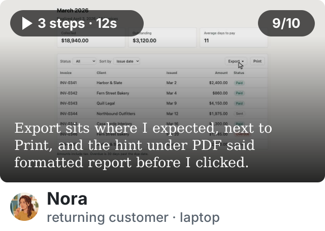

nothing to fix
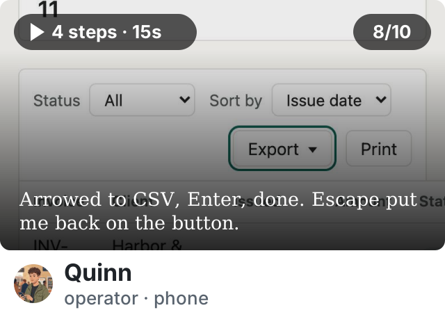
nothing to fix

The report toolbar with the Export menu open beside Print: CSV, rows as filtered; PDF, formatted report.
Measured
| Measure | This change | Total | Where |
|---|---|---|---|
 Tells in the chrome Tells in the chrome | 0 | 0 | |
 Declarations off the tokens Declarations off the tokens | 0 | 0 | |
 Controls without a name Controls without a name | 0 | 0 | |
 Page weight Page weight | 0 KB | 31 KB | no images |
For agents
nothing to do
About this review
Reviewed 3 files at 2f0a9c1. 2 of 2 routes rendered at 1280 and 390 px; 2 sessions. The menu opens from its button, arrows move between the two items, Escape and Tab close it and hand focus back, a click outside closes it.
Ledgerline is a sample app we keep for this. The review is written by hand in the shape the product posts, from the findings the app’s reference review names; the captures are real renders, the visitors and the counts are an example.
All checks have passed 3 successful checks
- ci / build Successful in 2m
- code review 2 comments
- impeccable / design review Ready · 5/5
Pull request successfully merged and closed
The report-export branch can be safely deleted.
Invite member modal #1287
- Conversation 4
- Commits 2
- Checks 3
- Files changed 3
codex-agent added 2 commits 8c41e0d
The invite is three questions on a card that looks like the app, and it works from the keyboard. One thing stops it doing its job: Send invite closes the card and says nothing, so an admin cannot tell the invitation went. And role and permissions ask the same question twice.
 3/5 · Not yet: fixable before it ships
1 blocker · 2 on the job · 1 in the changes · 2 in the details · 3 sessions
Does it do its job?
Sessions
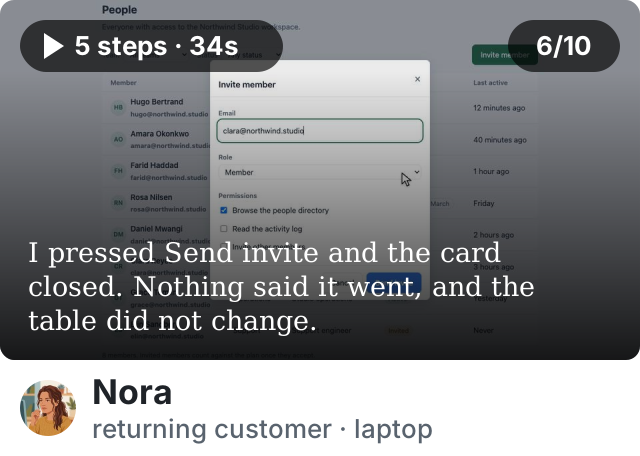

Sent the invite and could not tell.
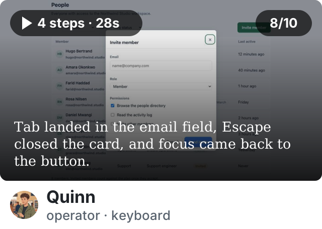
nothing to fix
nothing to fix

Send invite ends in silence
/ · Invite member
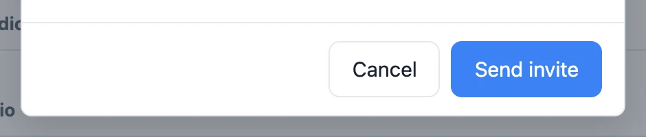
The card closes and clears. Nothing says the invitation went, the People table gains no Invited row, and Activity, where the description says it shows up, is unchanged. An invite that vanishes without a word has not been sent as far as the admin can tell.
 Keep the card open until the email passes, then say what happened: an Invited row in the table, or a line in Activity. If Activity is not wired yet, say so on the card.

Role and permissions ask the same question twice
/ · Invite member
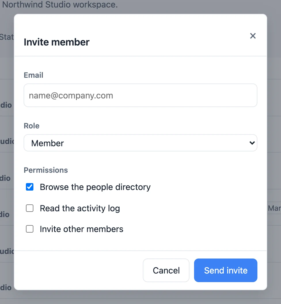
The role decides what a person can do, and three checkboxes under it let the admin contradict it: a Member with the directory unchecked, a Workspace admin who cannot invite. The invite should ask who and what role, and show what the role allows as a sentence; permissions belong on the person’s page, after they exist.
Drop the checkboxes from the invite. Under the role, one line: what a Member can do. Edit permissions on the member’s page.
Does each change hold up?
Invite member dialog  /
/
Send invite is blue in a green app
styles.css:388
The button hardcodes #3b82f6. Every other primary, the Invite member trigger included, is the forest green --accent token. White on that blue is 3.7:1.
Drop the colour rules and let .btn-primary style the button.
Is the craft clean?

The close button has no name
index.html:184
A bare × with no aria-label: a screen reader announces “button” and nothing else.
Give it aria-label="Close".
The dialog is on its own spacing rhythm
styles.css:304
22 px between fields where the rest of the stylesheet moves on the 8 px scale.
Replace the literal with --space-lg.
Measured
| Measure | This change | Total | Where |
|---|---|---|---|
| Tells in the chrome | 0 | 0 | |
| Declarations off the tokens | 3 | 3 | styles.css:304, :376, :383 |
| Shipped values against DESIGN.md | 1 | 1 | #3b82f6 where the accent is green |
| Low-contrast text | 1 | 1 | Send invite, 3.7:1 |
| Controls without a name | 1 | 1 | the close button |
| Functional text under 11px | 0 | 0 | |
| Page weight | +4 KB | 47 KB | no images |
For agents
P1 · Send invite ends in silence · / · modal.js:29 · fix: keep the card open until the email passes, then an Invited row or a line in Activity.
P2 · Role and permissions ask the same question twice · / · index.html:196 · fix: drop the checkboxes; one line under the role saying what it allows.
P2 · Send invite is blue in a green app · / · styles.css:388 · fix: drop the colour rules; let .btn-primary style it.
P3 · The close button has no name · / · index.html:184 · fix: aria-label="Close".
P3 · The dialog is on its own spacing rhythm · / · styles.css:304 · fix: --space-lg.
About this review
Reviewed 3 files at 8c41e0d. 2 of 2 routes rendered at 1280 and 390 px; 3 sessions. The dialog opens with focus in the email field, traps it, closes on Escape and returns focus to the button.
Crewline is a sample app we keep for this. The review is written by hand in the shape the product posts, from the findings the app’s reference review names; the captures are real renders, the visitors and the counts are an example.
Every other primary in the app takes the --accent token; this one hardcodes the blue.
Suggested change
codex-agent pushed 1 commit
All checks have passed 3 successful checks
- ci / build Successful in 2m
- code review 2 comments
- impeccable / design review Ready · 5/5
Add a show settings page #2210
- Conversation 4
- Commits 3
- Checks 3
- Files changed 4
codex-agent added 3 commits 8c41e0d
The page is the right shape and reads in one pass: a short form that says where each thing shows up, on the app’s own ground. One thing would hurt a host: Delete show is dressed as the happy path, one click from 48 episodes gone. Two decisions go against the app: a sidebar of its own, and a section that is a heading over nothing.
3/5 · Not yet: fixable before it ships
1 blocker · 3 on the job · 1 in the changes · 2 in the details · 3 sessions
Does it do its job?
Sessions
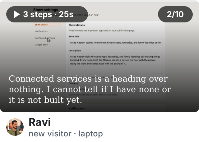

Stuck at Connected services: nothing to connect, nothing said.
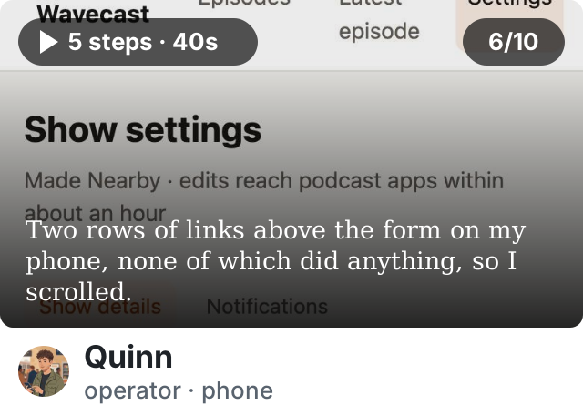
Found the setting past two rows of dead links.
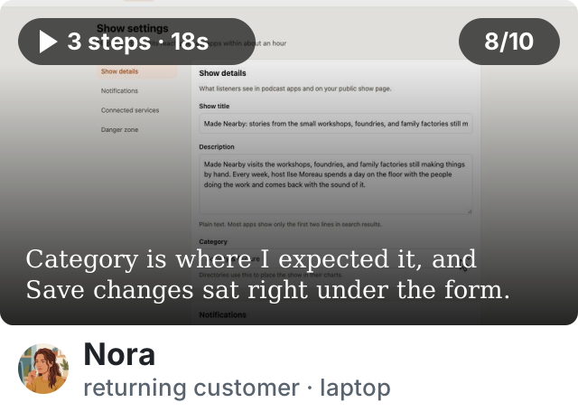
nothing to fix
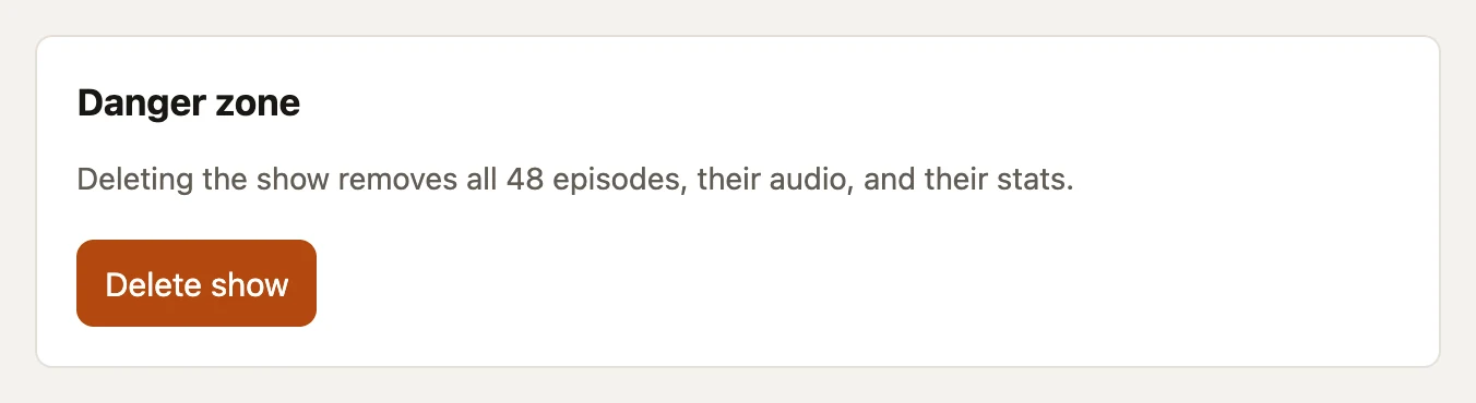
Delete show is dressed as the happy path
/settings.html · Danger zone
The same fill and weight as Save changes, a few lines below it, and one click is the whole flow: no confirmation between the click and 48 episodes gone. The note above it says what deletion removes, which makes the button more dangerous, not less.
Give Delete show a destructive treatment, an outlined --danger button, and a confirmation that names the show and what goes with it, with Cancel as the default.
The page invents its own navigation
/settings.html · sidebar
A sidebar of four section links while every other page navigates from the masthead. Nothing updates its current state, and on a phone it wraps into two rows of links between the heading and the first field. Four sections on one short page do not need a second navigation.
Cut the sidebar and its column. The section headings already do the job.

Connected services is a heading over nothing
/settings.html · Connected services
An empty list under a heading. A host cannot tell whether they have no connected services or the feature is not built yet, and the PR body knows the answer.
Write the empty state: one sentence saying the Spotify and Apple sync is coming and nothing needs doing now. If that cannot be written yet, leave the section out until it can.

Does each change hold up?
Show details form /settings.html
The title field is one line for a title that is not
settings.html:38
Show title is a single-line input, and the 105-character title runs off its right edge. The hint says apps show only the first two lines of the description; nothing says where the title is cut. The one field a host comes here to fix hides the part that matters.
Make it a textarea sized to the title, with the directory’s limit beside it as a count.

Is the craft clean?
Two field names reach no control
settings.html:49
The Category label points at an id the select does not have, and Description is a heading above a textarea with no label. Both look labelled and neither is.
Point the label at category, and turn the Description heading into <label for="show-description">.

Spacing in the new sections is off the app’s scale
styles.css:194
28 px gaps, 18 px section padding and a 10 px rhythm where the rest of the app moves in 12, 16 and 24.
Replace the literals with the steps the stylesheet already names.
Measured
| Measure | This change | Total | Where |
|---|---|---|---|
| Tells in the chrome | 0 | 0 | |
| Declarations off the tokens | 9 | 9 | styles.css:194, :200, :226 … |
| Shipped values against DESIGN.md | 0 | 0 | |
| Controls without a name | 2 | 2 | Category, Description |
| Low-contrast text | 0 | 0 | |
| Functional text under 11px | 0 | 0 | |
| Page weight | +11 KB | 58 KB | no images |
For agents
P1 · Delete show is dressed as the happy path · /settings.html · settings.html:91 · fix: destructive treatment plus a confirmation that names the show.
P2 · The page invents its own navigation · /settings.html · settings.html:23 · fix: cut the sidebar and its column.
P2 · Connected services is a heading over nothing · /settings.html · settings.html:77 · fix: write the empty state, or leave the section out.
P2 · The title field is one line for a title that is not · /settings.html · settings.html:38 · fix: a textarea sized to the title, with the limit as a count.
P3 · Two field names reach no control · /settings.html · settings.html:49 · fix: label for="category"; label the description.
P3 · Spacing off the app’s scale · /settings.html · styles.css:194 · fix: the named steps.
About this review
Reviewed 4 files at 5b2d91e. 3 of 3 routes rendered at 1280 and 390 px; 3 sessions.
Wavecast is a sample app we keep for this. The review is written by hand in the shape the product posts, from the findings the app’s reference review names; the captures are real renders, the visitors and the counts are an example.
codex-agent pushed 1 commit
All checks have passed 3 successful checks
- ci / build Successful in 2m
- code review 2 comments
- impeccable / design review Ready · 5/5
Code review caught up with agentic development. Design review did not.
Teams ship many times the pull requests they used to, and the designer is out of the handoff. Slop in the code gets an AI reviewer on every PR; slop on the screen gets nobody, and it compounds into the brand, the numbers and the people who stop coming back. Impeccable for PRs is the design reviewer: one more check to gate on, one more comment to satisfy, with the fix in it.
Join the beta.
For teams with a frontend and a preview to render. Leave your email and you get one message when your seat is ready.
We keep your address and your note, plus salted hashes of your network address and browser so one machine cannot fill the list. No other mail, no sharing, no analytics on this page. The first mail carries a link that removes you.
You're on the list.
One email when the beta opens. Nothing before, nothing else.